Monday, June 8, 2015
Assignment 18 Version 2
Assignment 18 A - (there are two posts for this assignment)
This assignment was to create a hyperlapse video.
Technical skills include using a camera, After Effects and Photoshop. It also includes knowing when to shot portrait or landscape photos. . .
How do I think I did? Well, since I shot all of the photos in portrait mode my HD video does not fill the screen. I also think I would have added more steps in-between some of the shots. It is jerky and not smooth - but since I still feel kind of lost in AE I am ok with it --- BUT, see the next post, I tried another one.
Wednesday, June 3, 2015
Art Deco Assignment 19

Technical skills included using the drawing tools and text tools in Adobe Illustrator.
How do I think I did? I like it. This is one of my favorite things to do - illustration. I had fun making the poster and I am happy with the results.
Sunday, May 31, 2015
Interactive HTML5 Slider - Thematic Text Assignment 17

This assignment was to create an Interactive HTML5 Slider that involved Thematic Text.
Technical Skills for this assignment included using Photoshop to lay out the letters and masks to add the texture. In addition the interactivity was created in Adobe Edge Animate.
 How do I think I did? I think I did the assignment :) It does what it is required to do (and that is a good thing.) I found that it took longer than I had anticipated because the version of Edge Animate I used was different from that of the lesson. A critical piece of the interactivity was very different and although I searched the web for answers I could not find the solution. Finally instead of continuing to search tutorials on-line I just typed in the necessary code - but I am not sure I could do any other kind of interactivity unless I already had the code - or I figure out how to work the CC 14 version.
Sliced Webpage Assignment 16

This assignment called for creating a web page design in Photoshop and then creating it in Dreamweaver.
Technical skills included creating a design in Photoshop, using the slice tool in Photoshop and then putting those slices into a layout in Dreamweaver.
How do I think I did? I did just fine. Because I did not put the header at the very top I had a little more challenge getting everything where I wanted it, it took some playing around with positions but it finally worked (and hey, I learned a little something). The slice tool in Photoshop is a little picky, maybe I sliced too much?? Anyway, it hit all the points that the assignment called for.
Interactive PDF Assignment 15

The technical skills used were illustrations in Illustrator and then creating buttons and bookmarks in InDesign.
How did I do? I like how it turned out. I wanted to create something that I could also use for Nativity House so I took quite a lot of time on the illustration. Nativity House is a brand new building so I wanted to capture all the little details. I really enjoy doing illustrations so this project was fun for me.
Saturday, May 30, 2015
Shape Animation Assignment 9
This assignment was to animate vector shapes in After Effects. The goal was to make a 30 second video with various animated shapes.
The technical skills were in Adobe After Effects. Using the shape tools and pen tool and then the various effects to animate the shapes. Technical skills included using the time line and key frames.
How do I think I did on this assignment? Well, I think I did much better than I thought I would. I have not used After Effects to a great extent so I was not sure how to even begin. However, as I started and through much trial and error I got an animation that I kind of like. Of course, as I watch it I see parts that I would change, but overall I am happy with the final result.
Monday, May 18, 2015
Zeotrope assignment 14
This assignment is a Zeotrope, or rather an optical illusion.
I was trying to create something that when the black lines passed over them they looked in motion.
Technical skills included Adobe Illustrator, Adobe After Effects and Adobe Premiere Pro. Shape creation, work with layers and actions.
I think it is ok. I am not a big fan of this type of animation. I think it looks low tech and it is just not my favorite. However, I was trying to make it look like smoke was coming off the coffee cups - I think I did that.
Assignment 13 Content Management System (sounds fun, right?)
 |
| This is my Wordpress.com design |
This week the assignment was to create pages in a Wordpress.com template.
To see the McTiser Design pages Click Here.

Technical skills included using Photoshop to size and prep pictures and navigation of the
WordPress.com template and site.

How do I think I did? Well, I think I did fine. It was not easy trying to come up with what to put on each page. Navigation of the site was not too difficult, but it did take a little time to figure out exactly how it works.
The pictures included here look much better when you actually click the link. Just in case you missed it above
to see the pages please click here.


Tuesday, May 12, 2015
3D Pop Up Gallery (assignment 7 DDSGN 220)
My 3D Gallery is created with pictures I took on our trip to the American SW in the summer of 2014. It is an ancient and beautiful region and I found a lot of opportunities to take photos.
The assignment was to create a 3D photo Gallery in After Effects. The camera was to scroll from side to side displaying the photos. It was to look like the photos were sitting on the ground/table/shelf.
The technical skills included using Photoshop to prep the photos and then After Effects to create the Gallery and finally Premiere Pro to finish the video.
How do I feel I did? Well, I like the finished product. I had quite a bit of trouble with the lights and shadows. I think I spent just as much time (or more) in trying to get the lights placed in a manner that did not blow out one picture and put the other in shadow. If I had unlimited time I would go back and work on all of the little details that I see when I watch it.
I liked this project and think I may use this technique to do other photo galleries.
Monday, May 11, 2015
Assignment 11 Webpage from template (DDSGN 220)


This assignment was to use a webpage template and modify to create it to look like a business page or a portfolio page. I did a business page.
Technical skills involved this week involved using Photoshop to size and prep the photos and Dreamweaver to modify the template.
How do I think I did? I think it looks ok. I think if I were to do this for a real business it would have been easier to come up with the topics. I understand how to modify the template and I understand how to sell something when you have something to sell. Since the goal was to either make a business site or a portfolio I went with the one I felt more comfortable with. I'm not sure what a portfolio webpage looks like - I mean I get it, it is a portfolio so it should show best works or rather the works that will 'sell' your work/skills. Like I said above I am happy my final work on this assignment. I like the overall look even if all of the boxes don't make a lot of sense.
Until Later. . .
E-Cig Poster Assignment 12 (DDSGN220)

This assignment was to create a poster that raised awareness about the dangers of vaping/e-cigarettes. The instructions said to gear the poster to middle and high school students. The poster should raise awareness of the Pierce County ordinance regarding e-cigs. As I read through the ordinance there were a lot of items about where and when the e-cigarettes could be smoked. There was also a lot of information about the dangers. I tried to accomplish a middle ground. If the poster is geared toward middle and high school students it did not really lend itself to talking about where adults could smoke. For minors they cannot smoke them at all. Thus, my poster is more about telling the kids they should not smoke them, not where adults can.
Technical skills. I used Illustrator to create the artwork. I used the pen and tablet again and am starting to get a better feel of how it works. I used InDesign for the overall layout. I am very familiar with InDesign as I use it almost on a daily basis in my job.
I am happy with my poster. My goal was to keep it very simple so a student would read it. I did not want to come right out and say 'Don't smoke!" because I think they hear that enough. I wanted to present practical reasons why they should not. I like the overall look of the poster. If the information was provided I would have put more contact information on the poster.
Until later. . . don't smoke!
Sunday, May 10, 2015
Font Creation Assignment 10 (DDSGN 220)

This assignment called for the creation of a font set. . . well the capital letters of a font set. The process in and of itself was not too difficult, however, I found it a little more difficult to decide what type of font to make. There are a lot of poor capital letters that were thrown away before I finally decided to just capture a version of my own handwriting. This turned out to be a little more difficult than I thought it would be - first of all it is NOT the same as writing on a piece of paper, even using a tablet and pen instead of a mouse, it still was a totally different feel (probably because I have not been using the pen and tablet for very long). I was 'trying' to capture my capital letters, the ones I make on a daily basis when I am using pen and paper.
The technical skills used for this project would have to be the brush tool in Illustrator and the copy and paste functions of the various programs (there was a lot of copying and pasting) (a lot!).
I also was introduced to the font creation program 'Font Creator 4'. I feel I barely touched the surface in the font creation program, but I understand the basic principles. I should also mention the pen and tablet (see above) and my attempts to use it as I would a piece of paper -- I need some more practice.
How do I feel I did? Well, I think I did ok. My handwriting is something I've always paid close attention to - I've found myself re-writing my notes because I did not like how they looked - thus I think it would take me many, many hours to duplicate my best handwriting as a font. As soon as all of my homework is done, the lawn is mowed, my house cleaned and the other projects I've promised to do for friends/family is finished I want to try again, try to create a font or fonts as I think this could be a fun way to spend my time.
Since we are on assignment 10 I thought I would refresh your memory (for those of you who are not in the class with me); this blog is a part of each homework assignment. We are to answer 3 questions each time: What were you trying to accomplish? What technical skills did you use to create the project? How do you feel you did?
Until next time. . .
Saturday, April 25, 2015
Assignment 8 Card Game Design


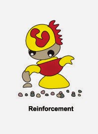

This week the assignment was to design some cards for a game called 'The Wall'. We were to design the card back (the first picture), a damage card, a reinforcement card and a wall card (last picture). I was trying to create cards that would be fun for a card game. The card back is a picture of a wall taken from the ruins of the Anasazi people who lived in the SW United States around 1,000 AD. Their walls are still standing so I thought it was a good example of what a wall should be. My damage card. . . well you can see damage in an armed hornet. My reinforcement card, I call him my mortar man. He is able to mix up mortar in no time flat - a good thing to have around a rock wall. The wall itself has some structure - a pattern of sorts.
The technical skills used were in Illustrator. I played with the pen tool a lot. I also used the paint brush a little. The other technical skills had to do with following the formatting of the card; using a full bleed for the card back and specific specs for the other cards.
How do I feel I did? I like my cards. I was very happy with the hornet as it started off as some shapes with the pen tool and evolved into the armed hornet. My mortar man is one of my favorites - I'm not sure why, I just really like the little guy.
Until next time -
Monday, April 20, 2015
Assignment 6, the Online jQuery Photo Gallery

This assignment included creating a web page with a photo gallery. I was really, really glad that my class last quarter was web design (yea!)
I was trying to create a web page that had a photo gallery. I wanted one that was simple but hit all the points for the assignment. I wanted to create a theme to the pictures.
The technical skills I used involved Dreamweaver and Photoshop. I sized the pictures for the web in Photoshop and then created the page in Dreamweaver. I created a header, the content section and a footer. I used the skeleton page given to us as it fit the look I wanted.
I think it turned out ok. I like the black background and how the photo gallery looks. I was really, really glad that I take very good notes for each class :)
Assignment 3 - A Vinyl based sign

This is what my vinyl sign will look like - once I can actually stick it together. I will post another picture once I have the actual product.
In this assignment I was trying to create a vinyl sign. The word here is 'trying'. I had no problems making the design, I also had no problems cutting the vinyl into the design, however, this is where my comprehension broke down. Once I had the pieces what did I stick it to? What was used as a background??
After thinking about it for a bit and actually looking at the pieces I finally had a light bulb moment and it clicked. HOWEVER, I still had a tiny problem because the McTiser Design piece was missing the s. Now I knew I could not just have McTi er Design, because - well just because. I also knew I had no more time (or vinyl) to go to school and cut it again. So, being the craft person I am I used a scrap of the vinyl and cut out my own s. Now all I need to do it stick it on the background and then take a picture so you can see it.
I was trying to accomplish a final piece that followed the guidelines.
The skills I used involved Illustrator and shapes and text. The skills I learned included using the vinyl cutter for the first time and how to pull off the extra vinyl so it did not eat my letters.
I like the design, I like the vinyl pieces. I think I will like the final result.
More later. . .
Assignment 5. I painted a tiny horse!

This week I learned how to use the drawing tablet. Needless to say I have had one since I started this whole student experience and up until now had never used it. I can say that it was a huge mistake not to use it before now because it makes using brush tools so much easier (although I felt I was becoming pretty good drawing lines with the mouse).
This picture is modeled after a photo I took last summer. We stopped in Mexican Hat, Utah and as we went for a walk came upon a tiny herd of horses. The herd was not tiny, but rather the horses were. Miniature little things in all colors. They followed us around and of course I had my camera and started taking pictures.
In this assignment I was trying to paint a digital picture. I'm not the best artist so I was a little nervous. I was trying to create something that would be recognized for what it was. To do this I used Photoshop and the drawing tablet. I primarily used the brush tool and the various shapes, sizes, opacity, and colors that it provided.
The last question I am to answer is; "How do you feel you did?" Well, I think I did ok. I spent a lot of time and I think I could spend a lot more time. I feel I did cover the requirements of the assignment. Overall, I guess I am happy with the final product - because, hey, you can tell it is a horse!
Monday, April 13, 2015
Assignment 4, A Christmas Party Logo

It always seems that the picture in my head is much better than what ends up on paper. Maybe I should not actually say that but instead say "Wow, whenever I think up a design it turns out EXACTLY like I had pictured it." To be fair, there are times when the design turns out better than I had imagined it. I don't think this was one of those times. It was not one of those times because of plain old time.
This week time seemed to get in my way. I have one word that will explain why. . . TAXES.
So, this week I was trying to create a logo for a family Christmas party. It was an assignment I thought sounded like fun. Then, the government's requirement that we file taxes on April 15th (my birthday!) got in the way. I did the best I could.
Technical Skills included Photoshop. Smart Mapping, and basic design.
How do I feel I did? Well, I don't hate it.
Monday, April 6, 2015
Assignment 2 Animated Photoshop Brushes
For my second ever blog post (well, it is assignment #2) I am sharing a short video that illustrates Animated Photoshop Brushes on a photo that I took in 2014.
I was trying to create a short little video that looked 'interesting' or 'entertaining'. (Yea, I know, how entertaining can a video be in 10 seconds?) When looking through my photos to pick one for this process I stumbled upon the one in the video. In my mind it would be fun to animate the figures with various clothing and styles. In my mind everything always looks better then it does in reality -- always.
Technically I used Photoshop (as mentioned in the title of the post) and brought in a variety of brushes to create the effects. From Photoshop the photo was taken to Adobe Flash for masking. I had fun playing with the masking and unmasking of the brushes in Flash. However, as it is one of the first times I've ever used Flash I did find myself making some mistakes and getting myself into situations in which I had to step back a lot of steps and try again. From Flash the production went to After Effects. I will admit in AE I was lost. I finally figured out how to de-saturate the video for a bit and let it come back to full saturation. I was happy with the results. . . but, when I took the creation into Premiere Pro I found that my effect did not transfer over (sad face here). So, I used Prem. Pro to de-saturate, or rather turn down the opacity - thus fulfilling the assignment requirement of some type of effect. I think this project took me longer than I expected it would, and overall I don't love it, but I don't hate it either.
Remember, this is the first assignment of the class - other than creating the blog (which, obviously I did) and I should get better as we go. That is the goal.
 |
| Painted in Illustrator by Cindy McNabb |
This blog post will answer 3 questions; Who you are, what you are doing, and what you want to be (of course these questions pertain to ME, not the reader. . . although as a reader you are more than welcome to answer those three questions on your own.)
Who Am I: as mentioned above, I am Cindy. I am a Mom, a Wife, a Daughter, a Employee, a Friend, a Co-Worker and a Student. After 20 years of teaching myself how to use digital design to make flyers, brochures, invitations, newsletters, etc. I decided it was time to make it official and get a degree in the field. Thus, I began my journey of going back to school.
Going back to school after many, many years of not going to school is a challenge. Taking an already full life and adding hours of studies can be hard. However, I have found that I really enjoy the studies and I enjoy having homework, after all, the homework is doing something I like to do. I have also found that my studies have allowed me to finish my design projects at work in a more professional manner.
What I am Doing: I'm not quite sure what this question refers to. What am I doing? Well, I am writing a blog and learning how to use Adobe Flash. If I dig a little deeper into that question I guess 'what I am doing' is learning. I am learning the design programs that allow me to produce higher quality publications. I am learning how to use these programs to enhance my photography. I am learning that I analyze every piece of mail that comes into my home - looking for flaws, mistakes, and trying to figure out how I would do it better. I am trying very hard to balance work, school, and my family.
What I want to Be: I want to be the best me that I can be. I'm already grown up so I guess I know what I want to be when I grow up -- (all of the above). If I had to pick something I would really, really like to do I have a couple of 'dream jobs'. The first is being a travel photographer. I would love to travel and take pictures. I would like to create coffee table books for all 50 states. I would start with my birthplace of Iowa and take pictures of all four seasons, the farms, the fields, the people, the history. From there I would go state to state. Another 'dream job' would be working on a catalog or designing product boxes. I would love to take the pictures for a catalog and then do the layout and design. I would also love to design product boxes. . . I don't know why, I've always thought it looked like fun.
That is my basic introduction. I guess I could have said a little more, like, I love to camp, travel, read, create jewelry, and spend time with my family. I could have said that my favorite color is blue, I love soft fabric, fringe, and want to someday own a horse. I could have went further and told you my favorite food is traditional Thanksgiving food or that I really want a maroon colored Chevy Camaro. But I thought those details might not be the most interesting, and remember at the beginning of this I said I would try to keep your interest and maybe even provide a bit of entertainment.
Subscribe to:
Comments (Atom)